Get Data: The dataRetrieval package
This is a short introduction to demonstrate how to access water data (flow, stage, water chemistry, etc) via the USGS dataRetrieval package. It will follow the same pipeline of downloading data, tidying, and then plotting and mapping that data for communication or reporting purposes. We’ll demonstrate how to download some data for a parameter, or a set of stations, or a specific region.
Let’s load the libraries we’re going to need first.
library(dataRetrieval)
library(here)
library(dplyr)
library(viridis)
library(ggplot2)
library(lubridate)
library(leaflet)
library(sf)
library(mapview)
library(USAboundaries)
library(DT)
library(plotly)Find Variables of Interest
This package has lots of functionality for many different data types. Let’s first load the library, and then look up the USGS parameter codes that measure nitrate. We’re using a grep() function here, which is a common way to look up text for any particular string, or part of a string.
# here we create an object of all the parameters that relate to nitrate
nitrCds <- parameterCdFile[grep("nitrate",
parameterCdFile$parameter_nm,
ignore.case=TRUE),]# how many rows
nrow(nitrCds)## [1] 119# how many different measurement units are there?
unique(nitrCds$parameter_units)## [1] "count" "None" "mg/l as N" "%" "mg/l" "mg/kg" "mg/kg as N" "% by wt" "ug/L as N" "mg/l asNO3" "mg/l NO3" "mg/m2 as N"
## [13] "ueq/L" "mg/m2" "mg/m2 NO3" "ton/d as N" "ug/l" "tons/day" "lb/d as N" "lb/day" "umol/L" "MPN/g" "ug/kg" "per mil"# try looking up flow
flowCds <- parameterCdFile[grepl("flow",
parameterCdFile$srsname,
ignore.case = TRUE),] # look in rows nrow(flowCds)## [1] 11How many parameter metrics exist for flow?
Find a Specific Variable/Parameter
Now that we know to look up the codes for different parameters (see the parameter_cd column), we can pick a few and search within given state or region.
For example, let’s stick with nitrate for a little bit, and say we get data for nitrate using the parameter code 00618, then specify we only want stations that collect that data in CA.
Bear in mind, if you run the following code chunk it may take a few minutes, as it’s retrieving all the stations that collect nitrate data with the 00618, and all the records for those stations (in California!). That’s because we use the seriesCatalogueOutput=TRUE here…later we’ll show an alternative. I’ve saved this rather large file here if you just want to grab it and avoid running this code chunk.
# select a code of interest
cd_code <- c("00618") # nitrate
# now run function: note with seriesCatalogOutput=TRUE, this can take a bit!
niCA <- readNWISdata(stateCd="CA", parameterCd=cd_code,
service="site", seriesCatalogOutput=TRUE)
nrow(niCA)
# OVER 1.2 million records!
# save(niCA, file = "data/nitrate_00618_CA_NWIS_2018.rda")Filter the Data
Then we filter down this massive dataset to sites that have more than 300 records, and have Tahoe in the station name. Then make a leaflet map! Leaflet is a nice interactive open-source map that we can generate using any spatial data in R.
# take a look at how many distinct stations are available
niCA %>% dplyr::distinct(station_nm) %>% tally # that's a lot!## n
## 1 9249# filter to stations with TAHOE in name and number of records > 300
niCA.Tahoe <- niCA %>% dplyr::filter(grepl("TAHOE", station_nm), count_nu > 300)
# make the data spatial with the sf
niCA.Tahoe.sf <- st_as_sf(niCA.Tahoe, coords = c("dec_long_va","dec_lat_va"), remove = FALSE, crs=4326)
# Mapview: make an interactive map quickly:
mapview(niCA.Tahoe.sf, layer.name="USGS Stations <br> collecting nitrate data")# Leaflet::Similar map as above, but more code/complexity
# leaflet(data=niCA.1) %>% # start with the data
# addProviderTiles("CartoDB.Positron") %>% # select a map
# addCircleMarkers(~dec_long_va,~dec_lat_va, # add the coordinates
# color = "red", radius=4, stroke=FALSE,
# fillOpacity = 0.8, opacity = 0.8,
# popup=~station_nm)Get Station Locations for Parameter
We can try the same command but with seriesCatalogOutput=FALSE. This means it doesn’t pull the actual records, but rather the sites where a given parameter is available. That means we won’t be able to filter by the number of records available for a given site, but we can see where sites are located. This example filters to a specific Hydrologic Unit Code (HUC), and makes another leaflet map.
# filter for phosporous
ph_code <- c("00662","00665") # phosphorous
phCA <- readNWISdata(stateCd="CA", parameterCd=ph_code,
service="site", seriesCatalogOutput=FALSE)phCA %>% dplyr::distinct(huc_cd) %>% tally## n
## 1 104# do some tidying!
phCA.1 <- phCA %>%
dplyr::filter(huc_cd == "16050101") # filter by HUC
# make the data spatial with the sf
phCA.sf <- st_as_sf(phCA.1, coords = c("dec_long_va","dec_lat_va"), remove = FALSE, crs=4326)
# Mapview: make an interactive map quickly:
mapview(phCA.sf, layer.name="USGS Stations collecting <br> phosphorous data")Get a Specific Site & Date Range
Let’s now download data for a specific site number and a specific date range. In this case, let’s look for flow at a site near Meeks Bay in Lake Tahoe.
siteNo <- "10336645"# GENERAL C NR MEEKS BAY CA
pCode <- "00060" # 00060 flow,
start.date <- "2016-10-01"
end.date <- "2019-03-01"
# get NWIS data
tahoe <- readNWISuv(siteNumbers = siteNo,
parameterCd = pCode,
startDate = start.date,
endDate = end.date)Clean & Filter Data
Now we have a nice dataset, but let’s tidy it up a bit. There are some built in functions that are part of the dataRetrieval library, let’s use them to add a Water Year column, and fix up the column names. Then we’ll filter to our Meeks Bay site, and plot.
# add the water year
tahoe <- addWaterYear(tahoe)
# rename the columns to something easier to understand (i.e., not X00060_00000)
tahoe <- renameNWISColumns(tahoe)
# here we'll calculate and add approximate day of the WATER YEAR (doesn't take leap year into account)
tahoe$DOWY <- yday(tahoe$dateTime) + ifelse(month(tahoe$dateTime) > 9, -273, 92)
# filter to Meeks site only (we currently have all tahoe)
phCA.meeks <- filter(phCA, site_no=="10336645")# plot flow with facets to see different years
(plot1 <- ggplot() + geom_line(data=tahoe, aes(x=DOWY, y=Flow_Inst), color="dodgerblue") +
facet_grid(waterYear~., scales = "free_y") +
labs(y="Hourly Flow (cfs)", x= "Day of Water Year", title="Hourly Discharge for General Creek Near Meeks Bay, Tahoe"))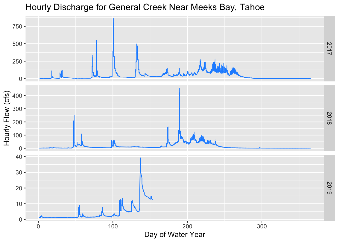
Use Spatial Data: A Watershed
Let’s work with some spatial data now. We’ll use the HUC boundaries for Squaw Creek, and crop our data by that watershed. These are the HUCs for the Squaw/Tahoe Basin of interest:
- HUC8: 16050102
- HUC12: 160501020202
- HU_12_NAME: Squaw Creek-Truckee River
For more info and training see the USGS page.
Read Shapefiles
By default when we read in a shapefile, the sf package will print out a bunch of metadata about the projection, dimension, type of data, etc. We can turn that on and off with quiet=FALSE. Let’s read in a HUC8 for Tahoe, and centroids for every single HUC12 in California.
h8_tahoe <- st_read("data/h8_tahoe.shp", quiet=FALSE)
#mapview(h8_tahoe)
# load huc centroids from a zipped directory! Here we have to wrap things in unzip()
unzip("data/huc12_centroids.zip", exdir = "data/huc12s")
h12_centroids <- read_sf("data/huc12s/huc12_centroids.shp", quiet = TRUE) %>%
st_transform(crs=4326) #%>%
# then remove raw files since file is added in memory
fs::dir_delete(path="data/huc12s/")# a map
mapview(h12_centroids) + mapview(h8_tahoe) That’s a lot of points! Sort of a messy map, so let’s see if we can crop by a certain area, and reduce the number of HUC12’s we use.
Crop By Boundaries And Plot
We’ll use a great package for working with State and County boundaries, called USAboundaries. It defaults to reading in data as sf objects (data.frames), which makes it much easier to manipulate and play with the data. First we download a few specific counties. Then we clip our HUC12 centroids by those counties. Note, we could be clipping by any sort of spatial data here, as long as both are using the same projection.
# set the state and county names of interest
state_names <- c("california")
co_names <- c("Placer", "El Dorado")
# get STATE data
CA<-us_states(resolution = "high", states = state_names) %>%
st_transform(crs = 4326)
# get COUNTY data for a given state
counties_spec <- us_counties(states=state_names) %>% # use list of state(s) here
dplyr::filter(name %in% co_names) # filter to just the counties we want
# CLIP our centroids by the county boundaries
h12_clip <- st_intersection(h12_centroids, counties_spec)# quick map!
mapview(counties_spec, legend=FALSE) + mapview(h12_clip, layer.name="HUC12 Centroids", col.regions="orange")There are a lot of different sf functions that make map operations fairly easy. Check out this page for a list of functions.
Get NWIS Data for Watershed
Now that we can find a specific HUC code for a watershed, we can use the functions we’ve learned above to download data for our watershed. Popular parameter codes include stage (00065), discharge in cubic feet per second (00060) and water temperature in degrees Celsius (00010).
Below we’ll download data for a single site, and specify a start date. We want the instantaneous data (usually 15 min intervals), so we’ll use “iv” as a flag.
sqw_mindailyT <- readNWISdata(huc="16050102", statCd=c("00001", "00002","00003"), parameterCd="00010")
# rename the columns to something easier to understand (i.e., not X00060_00000)
sqw_mindailyT <- renameNWISColumns(sqw_mindailyT)
sqw_mindailyT <- addWaterYear(sqw_mindailyT)# how many sites total?
length(unique(sqw_mindailyT$site_no))## [1] 28DT::datatable(sqw_mindailyT, options=list(pageLength=6))Now we can select a specific site of interest and download data for that location and time interval.
# Prosser Creek-Truckee Drainage
# Stats: max (00001), min (00002), and mean (00003).
sqw10351600 <- readNWISdata(sites="10351600", service="iv",
parameterCd=c("00010", "00060"),
startDate=as.Date("2016-10-01"))
sqw10351600 <- addWaterYear(sqw10351600)
sqw10351600 <- renameNWISColumns(sqw10351600)summary(sqw10351600)## agency_cd site_no dateTime waterYear Wtemp_Inst Wtemp_Inst_cd Flow_Inst Flow_Inst_cd
## Length:120503 Length:120503 Min. :2016-10-01 07:00:00 Min. :2017 Min. : 0.00 Length:120503 Min. : 77.6 Length:120503
## Class :character Class :character 1st Qu.:2017-10-05 21:07:30 1st Qu.:2018 1st Qu.: 5.60 Class :character 1st Qu.: 301.0 Class :character
## Mode :character Mode :character Median :2018-08-16 21:45:00 Median :2018 Median : 9.40 Mode :character Median : 402.0 Mode :character
## Mean :2018-08-08 20:23:48 Mean :2018 Mean :10.86 Mean : 1058.0
## 3rd Qu.:2019-06-26 19:22:30 3rd Qu.:2019 3rd Qu.:15.20 3rd Qu.: 1120.0
## Max. :2020-05-05 17:45:00 Max. :2020 Max. :26.20 Max. :15400.0
## tz_cd
## Length:120503
## Class :character
## Mode :character
##
##
## Notice there are quite a few NA’s in this dataset. Let’s filter those data out, and then plot using ggplot. Here we’ll assign color to water temperature, and the y-axis can be the discharge (flow_csf).
# remove NAs
sqw10351600 <- filter(sqw10351600, !is.na(Wtemp_Inst), !is.na(Flow_Inst))
#summary(sqw10351600)
# a quick plot
ggplot() +
geom_line(data=sqw10351600, aes(x=dateTime, y=Flow_Inst, color=Wtemp_Inst)) +
labs(x="", y="Flow (cfs)", title="Truckee River Watershed") +
scale_color_viridis("Water Temp (C)") +
theme_classic()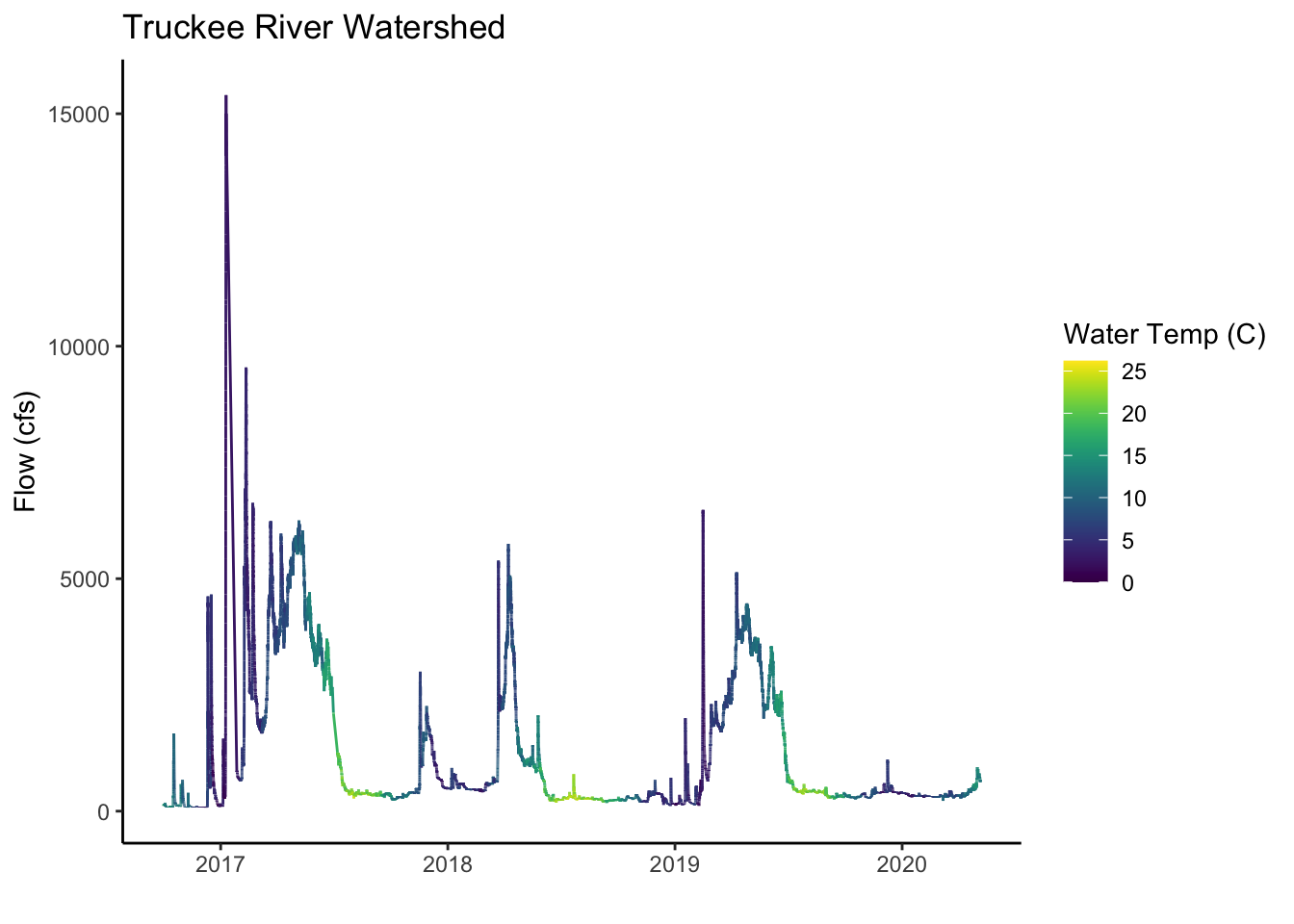
Aggregate/Summarize Data
One of the most common and tedious tasks is having to restructure, summarize, and simplify data. Here we’ll show how to use dplyr to aggregate our data to monthly timesteps, and then plot that data. One new function we show below is summarize_all which means we apply a set of functions (more than one) to all the columns in our dataframe. Since we group by month, we are calculating the mean, min, and max of temperature, flow, and date. The mutate function allows us to add new columns, and so we could easily add different time intervals here and then group_by those variables, and summarize by a different time interval.
# make monthly with dplyr
sqw_mo <- sqw10351600 %>%
rename(temp_C=Wtemp_Inst, flow_cfs=Flow_Inst) %>% # rename cols
select(dateTime, temp_C, flow_cfs) %>% # select cols
mutate(date = lubridate::as_date(dateTime), # add cols
month = lubridate::month(dateTime, label=T)) %>%
select(-dateTime,-date) %>%
group_by(month) %>%
summarize_all(c("mean", "max", "min"))# take the mean, max, and, min of all colsInteractive Plotting
And finally, we can plot our data in various ways. A package called plotly is handy for this sort of task, because it allows interactivity with the data.
# a static plot:
ggplot() +
geom_pointrange(data=sqw_mo, aes(x=month, y=temp_C_mean,
ymin=temp_C_min, ymax=temp_C_max,
group=month), color="blue",alpha=0.5) +
theme_bw() +
labs(x="", y="Water Tempature (C)", title="Truckee River Watershed", subtitle="Avg Monthly Water Temperatures in Squaw Creek")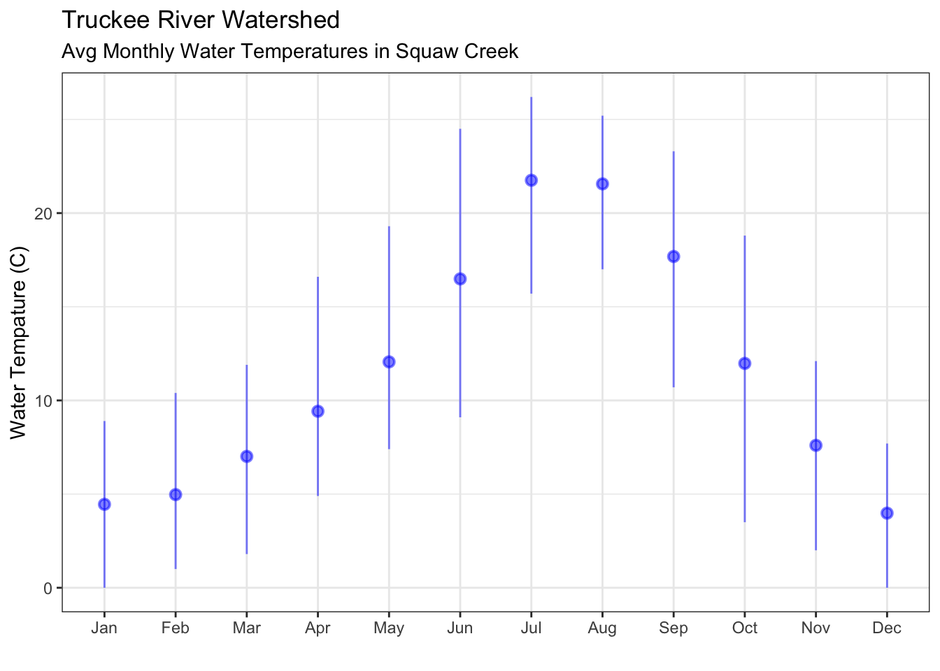
# an interactive plot using the plotly library
plotly::ggplotly(ggplot() +
geom_point(data=sqw_mo, aes(x=month, y=temp_C_mean), color="gray20", size=3, shape=2, alpha=0.7) +
geom_point(data=sqw_mo, aes(x=month, y=temp_C_max), color="maroon", size=3, alpha=0.7) +
geom_point(data=sqw_mo, aes(x=month, y=temp_C_min), color="navyblue", size=3, alpha=0.7) +
theme_bw() + xlab("") +
ylab("Water Temperature (C)"))Challenge: Can you try calculating the weekly min, max, mean, using the same code above, and then plot?